

The Pinpoint Press Trumponomics Methodology
How we gather and compute data comparing the Trump economy with 12 prior presidential terms.

I’ve been comparing the Trump economy with that of prior presidents since Donald Trump first became president in 2017. I was at Yahoo Finance at the time. The goal was to create a dataset that would address the question of how the current president is stewarding the economy, compared with his predecessors. Some people have strong opinions about this. I wanted hard numbers that would take some of the guesswork out of it.
We used this data to create a Trumponomics Report Card, which became the Bidenomics Report Card when Joe Biden took office in 2021. I left Yahoo in 2025 and took the Trumponomics project with me. Since then, graphic artist David Foster and I have created a new chartpack we update monthly and tweak regularly, to make it better.
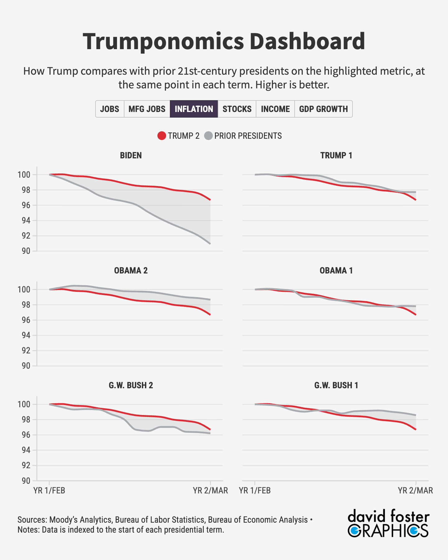
Here’s how we put it together. Moody’s Analytics provides data every month on employment, manufacturing employment, inflation, incomes, stock-market performance and GDP growth. This data goes back to the Jimmy Carter presidency in the 1970s. We index the data to the start of each presidential term. So the index for each metric begins at 100 when the presidential term begins.
We then measure change from that starting point on a month-by-month basis. That allows us to do like-to-like comparisons at the same point in each presidency. We are not measuring absolute levels of employment or GDP, but the change that occurred once each president took office. That’s why each president starts at the same point in charts such as this one:
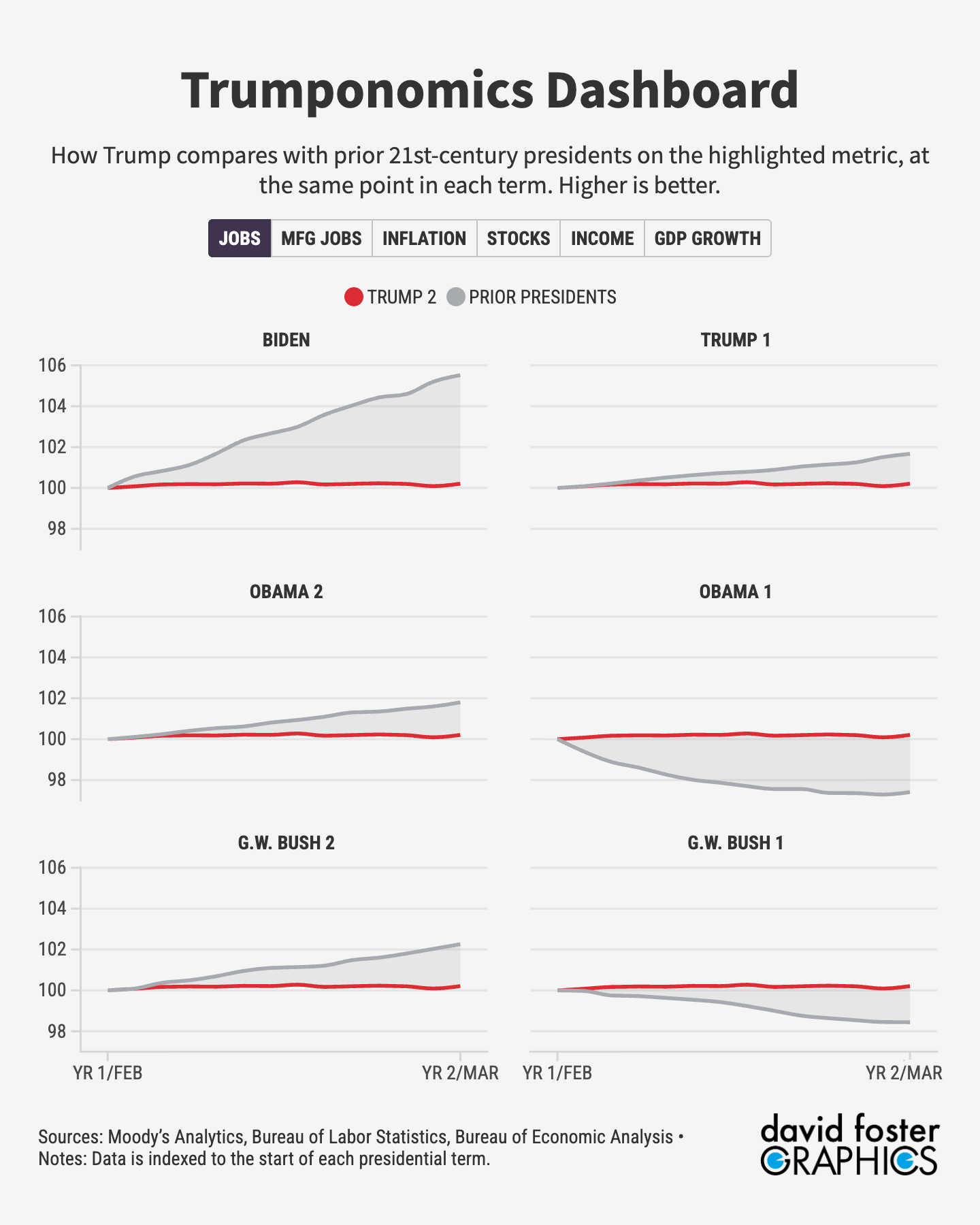
For five of the six metrics, a higher index number is better. If the index number for employment growth is 103, for instance, that means employment has grown by 3% since the start of the presidential term. The one exception is inflation, where a higher number is worse. An index number of 102 would indicate 2% inflation, which is better than an index number of 106, which would indicate 6% inflation. To make our inflation metric consistent with the others, we inverted it, so that a higher number indicates better performance on inflation, while a lower number indicates worse performance. This means that the index number in this one instance will typically be lower than 100. It would only higher than 100 if inflation were negative, which rarely happens.
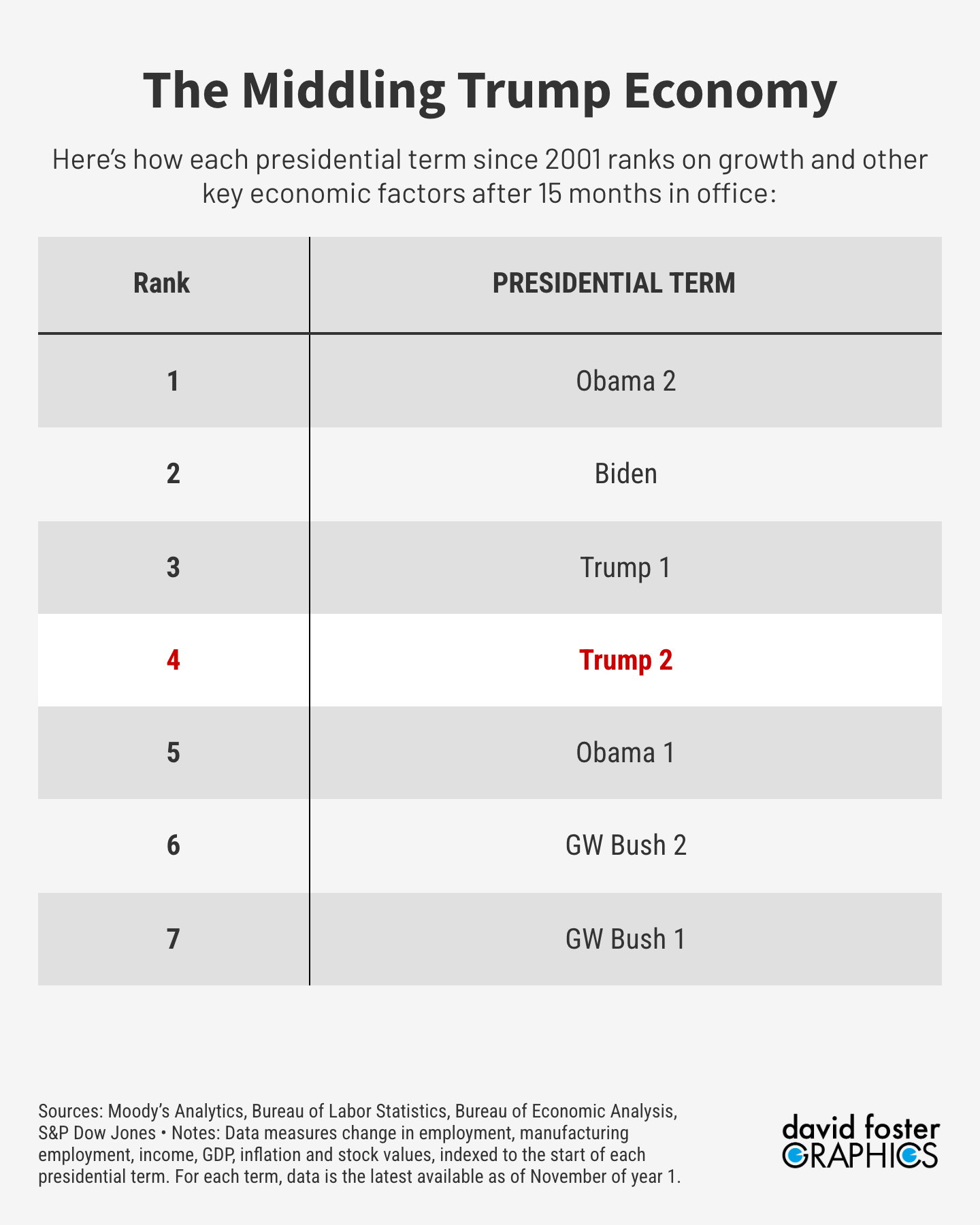
To rank each president’s overall performance, we compute the rank in each category for the latest month, then sum the rankings on all six metrics for that month. There is no subjectivity involved. Excel’s rank function sorts the index values for each metric, then does the same for all six metrics combined, for the given month. That gives us the presidential rankings.
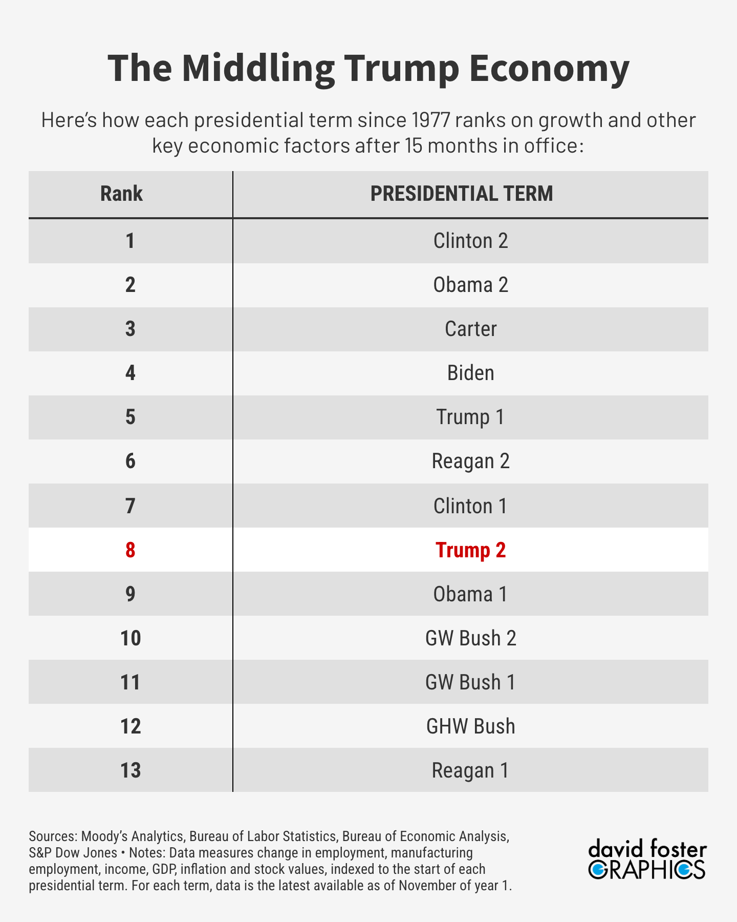
One note on our ranking technique. We originally ranked presidential terms by total number of index points in a given month. That produced a curious result. Barack Obama’s first term ranked No. 1 after 15 months, even though the economy back then was just emerging from the Great Recession and some economic numbers were still deteriorating. It turned out Obama’s top rank was entirely due to the monster stock-market rally that began in March of 2009. The Obama 1 stock index value was so large that it boosted his overall ranking to No. 1, even though he ranked last on employment and not much better on the other metrics. So we switched from ranking the aggregate index values to averaging out the category rankings, which removed that statistical bias. Obama 1 fell to the middle of the pack, which makes more sense.
We maintain two comparative datasets. Since we have data going back to the 1970s, we track Trump’s performance compared with 12 prior presidential terms. But presenting all that data is unwieldy. David Foster has an interactive graphic with all that data on his own web site, for anybody who wants to check it out.
It’s simpler to compare Trump with the last six presidential terms, which includes all the presidents of the 21st century. That’s the data you’ll typically find here.
If our rankings don’t comport with the way you remember a certain presidential term, it’s probably because we’re cutting off the data before the term was complete, to stay consistent with where Trump is in his current term. Many people remember the Carter years as gloomy, for instance, but it was doing pretty well until a recession hit during his final year in office. The economy boomed during Ronald Reagan’s second term, but the first 15 months of data don’t show that yet. When we’re at the end of Trump’s term and have 48 months of data for each president, the full picture will emerge.
Our data does not imply that any given president or his policies directly caused the economic changes that happened during that term. The US economy is a huge and complex machine affected by thousands of factors. Presidents generally have less control over the economy than many voters think, which we point out routinely in our coverage of the economy.
Yet presidents get credit or blame for what happens in the economy under their watch, whether they deserve it or not. Our Trumponomics data helps explain why voters feel the way they do.