

Introducing the Better-Off Index
Our data shows whether ordinary people are better off—or worse off—than than they were one year ago.

The vibecession. The K-shaped economy. The affordability crisis. These are all rhetorical efforts to capture what exactly is wrong with prosperity in America these days.
We’ve applied some data to the question. The Pinpoint Press constructed the Better-Off Index to gauge whether ordinary people are better off than they were one year ago. This is an intuitive way many people think about their finances, and it’s also a logical way to gauge the overall direction of the economy. The inflation rate, for instance, is the 12-month change in overall price levels.
The Better-Off Index encompasses four basic economic metrics. We start with the overall employment level, because that reveals whether jobs are becoming more or less plentiful. We include real income, which is adjusted for inflation, because it captures whether purchasing power is increasing or decreasing. We add home affordability, which accounts for the burden of most people’s biggest expense. Finally, we wrap in stock prices, since that accounts for the value of investments and retirement accounts.
For each of these, we calculate the year-over-year change every month. Then we aggregate those figures into a single index number that represents whether the direction of the economy is better or worse than it was one year earlier. We do a separate index by stripping out stocks, so that seriesrepresents just three things: the 12-month change in employment, real income and home affordability.
The results validate the affordability crisis and explain why it’s happening, as these charts show.
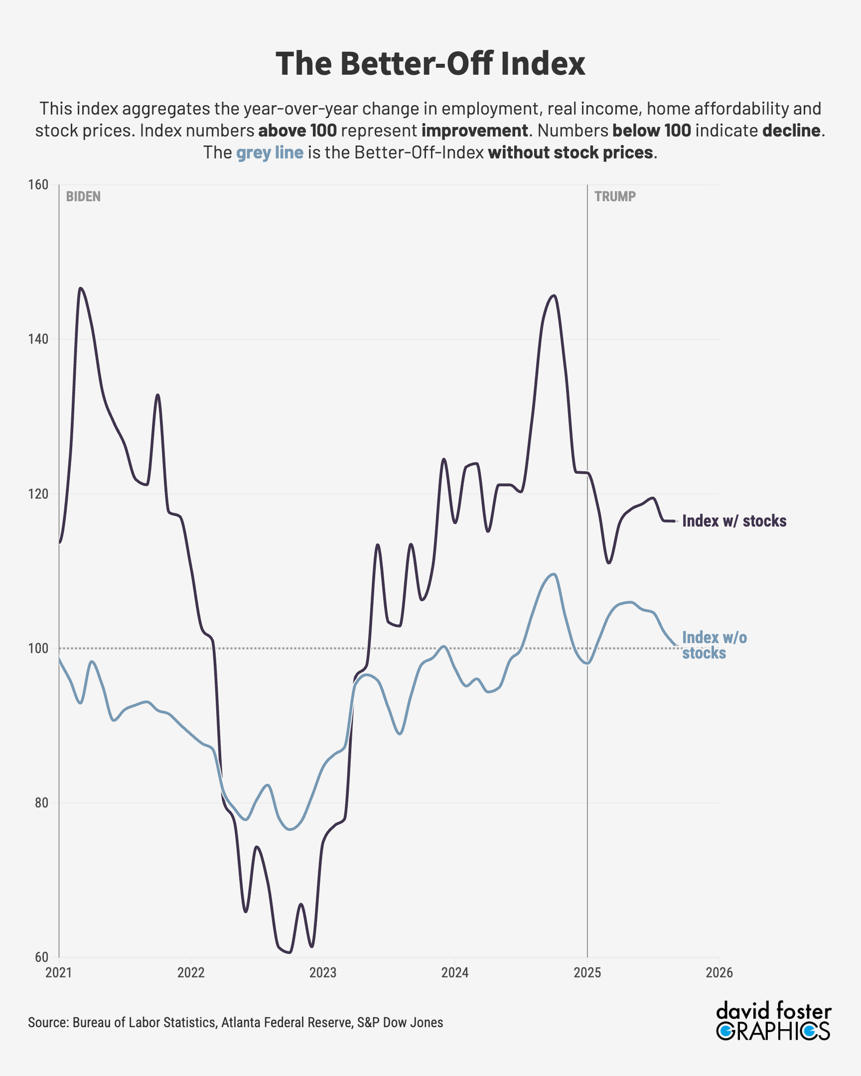
Since any number above 100 represents a better-off economy, the current reading, which is 116, looks pretty good. But when you strip out stocks, the index is a flat 100—no better or worse than one year ago. And it’s been heading downward since May, which supports the feeling many people have that something is going wrong.
What exactly is the problem? Here’s what’s happening with each of the four components of the index:
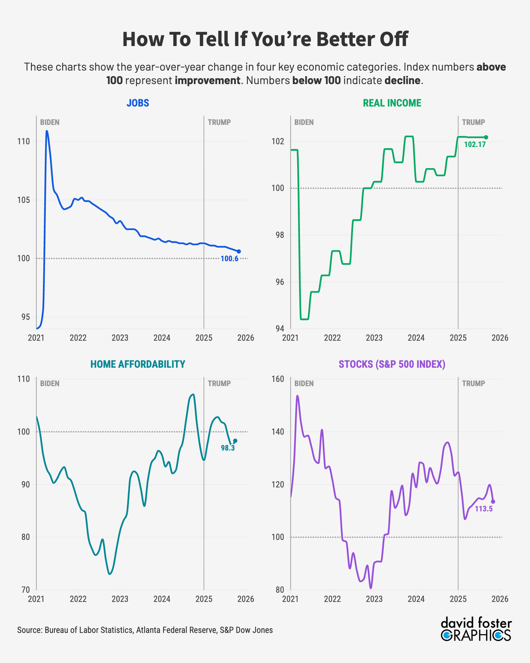
There have been two important changes during the last few months. The first is the slowdown in employment. Current employment levels are slightly higher than they were a year ago, but the year-over-year improvement has been declining as hiring slows.
Housing affordability, which comes from data collected by the Atlanta Federal Reserve, has deteriorated slightly from levels of one year ago, mainly because the median home price has risen by more than 5%. It takes 43% of median income to pay for the typical home, up from 42% a year ago.
That’s the K-shaped economy in numbers. People who own stocks are better off because the market was up 14% at the end of November, compared with one year earlier. If you don’t own stocks, you didn’t enjoy that wealth boost and you’re roughly equal to where you were one year ago. Plus, you sense that jobs are getting more scarce and housing is getting a little more expensive.
Everybody’s circumstances are different, of course. One index can’t speak for everybody. But the Better-Off Index tracks well with developments in the economy during recent years.
The worst showing of the last five years came in October 2022, when inflation was nearly 8%. That hammered purchasing power and pushed real incomes well below year-earlier levels. Home affordability was worsening, with the average mortgage more than doubling in 12 months. And a stock selloff was eating into wealth, rather than creating it. For 12 months in 2022 and 2023, the Better-Off Index excluding stocks was higher than the index including stocks, as the first chart above shows.
These numbers can obviously change fairly quickly, affecting consumer confidence, the direction of financial markets, presidential approval and many other things. The Better-Off Index will show up frequently in future reporting at The Pinpoint Press, as we do our best to explain what’s happening to the fortunes of ordinary people and what policymakers ought to do about it.