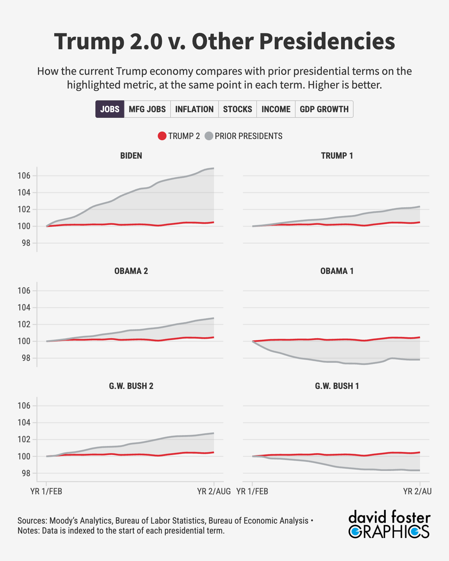
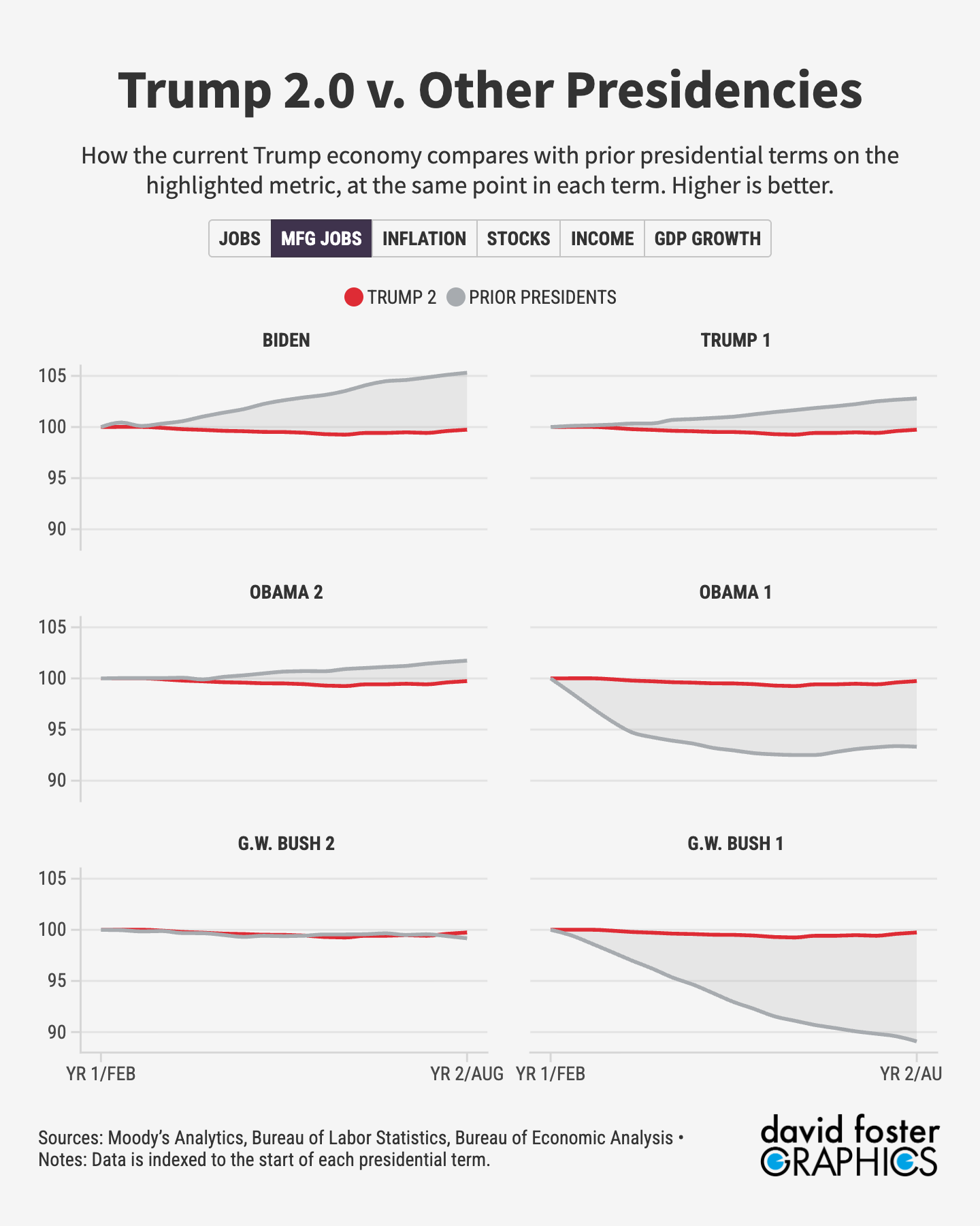
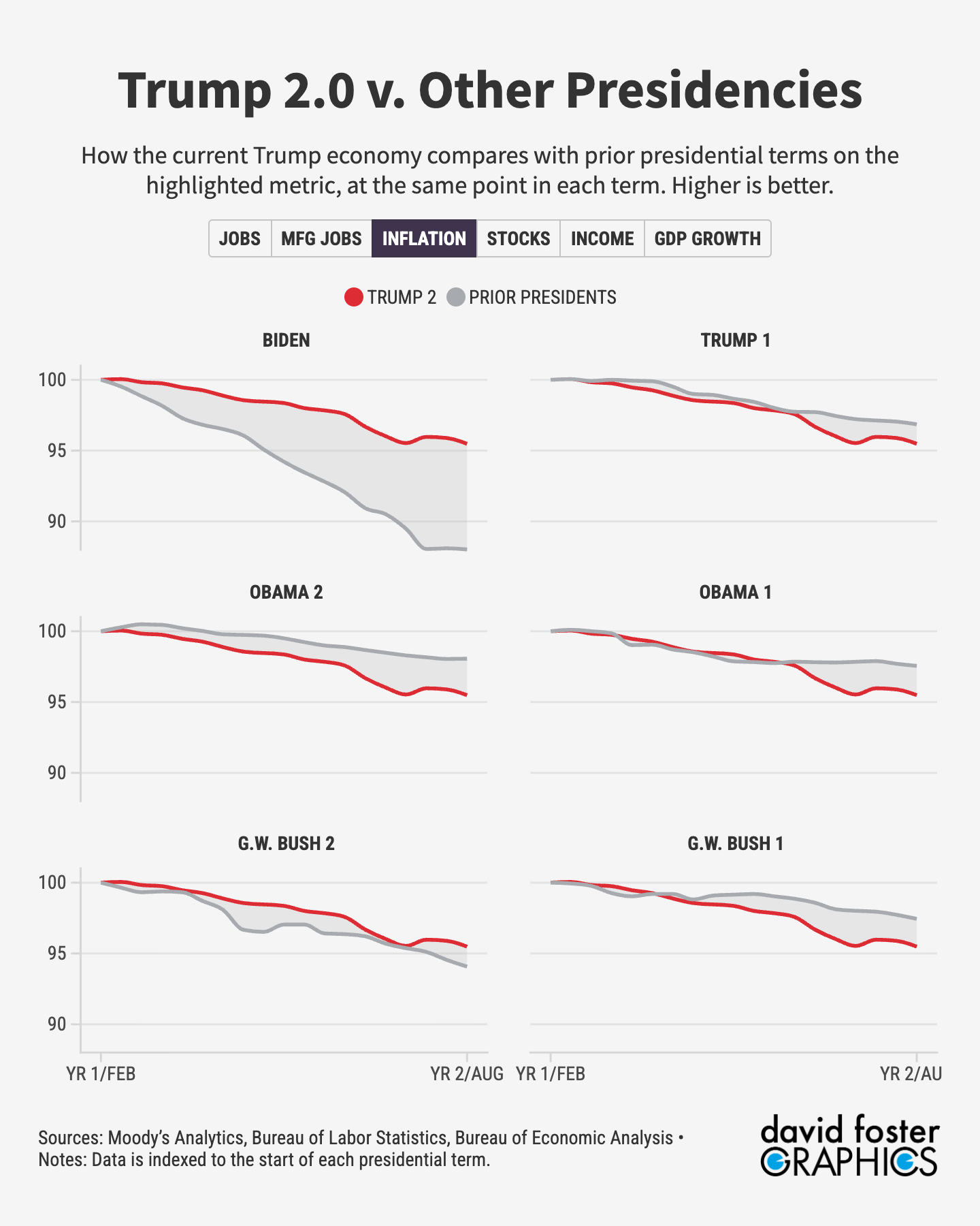
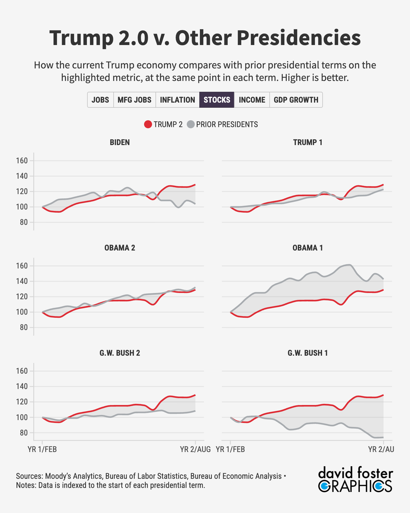
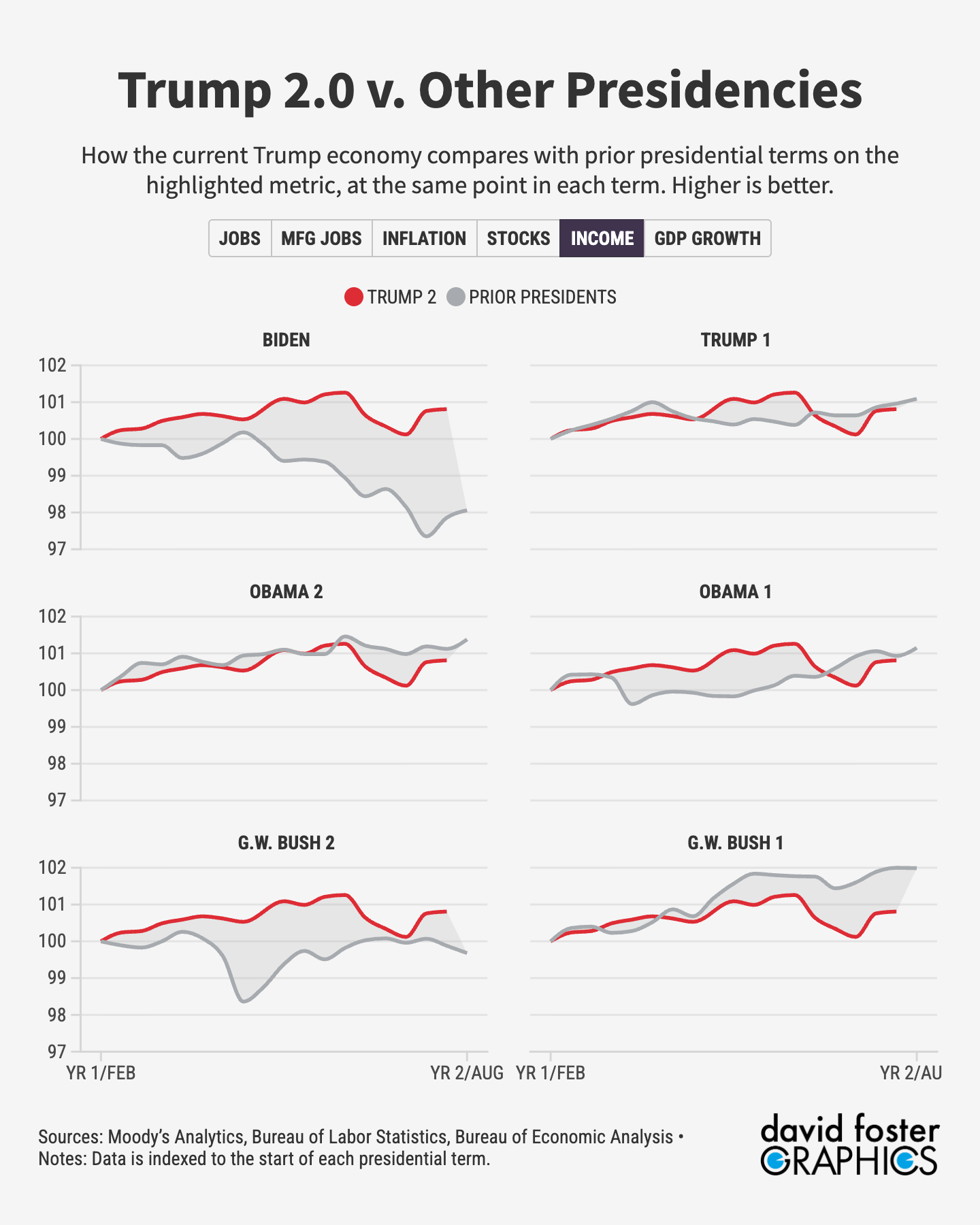
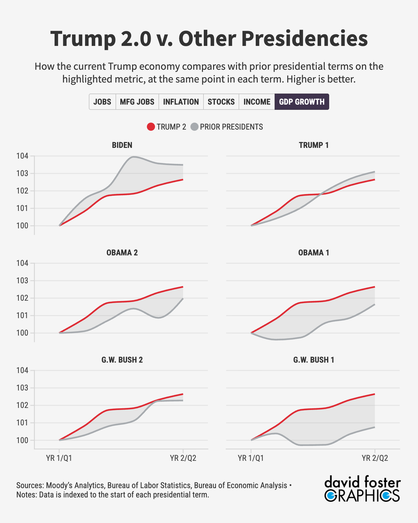
President Trump claims he has ushered in a new Golden Age in the US economy. Has he?
This is where you can decide for yourself. The Pinpoint Press Trumponomics Dashboard lets you compare the Trump economy with that of prior presidents, at the same point in each presidential term. We track six key metrics using data provided by Moody’s Analytics: Overall employment, manufacturing employment, inflation, stock-market performance, income growth and GDP growth. David Foster provides the graphics and maintains an interactive version for anyone who wants to play around with the tabs.
We update this data once a month, usually around the time the monthly jobs report comes out. The data is indexed to the beginning of each presidential term, so it shows how the economy changed from the time each president took office. That allows apples-to-apples comparisons among the presidents.
The charts below show the Trump economy compared with other 21st century presidents, starting with George W. Bush in 2001. For data going back to the 1970s, check out the interactive graphic.
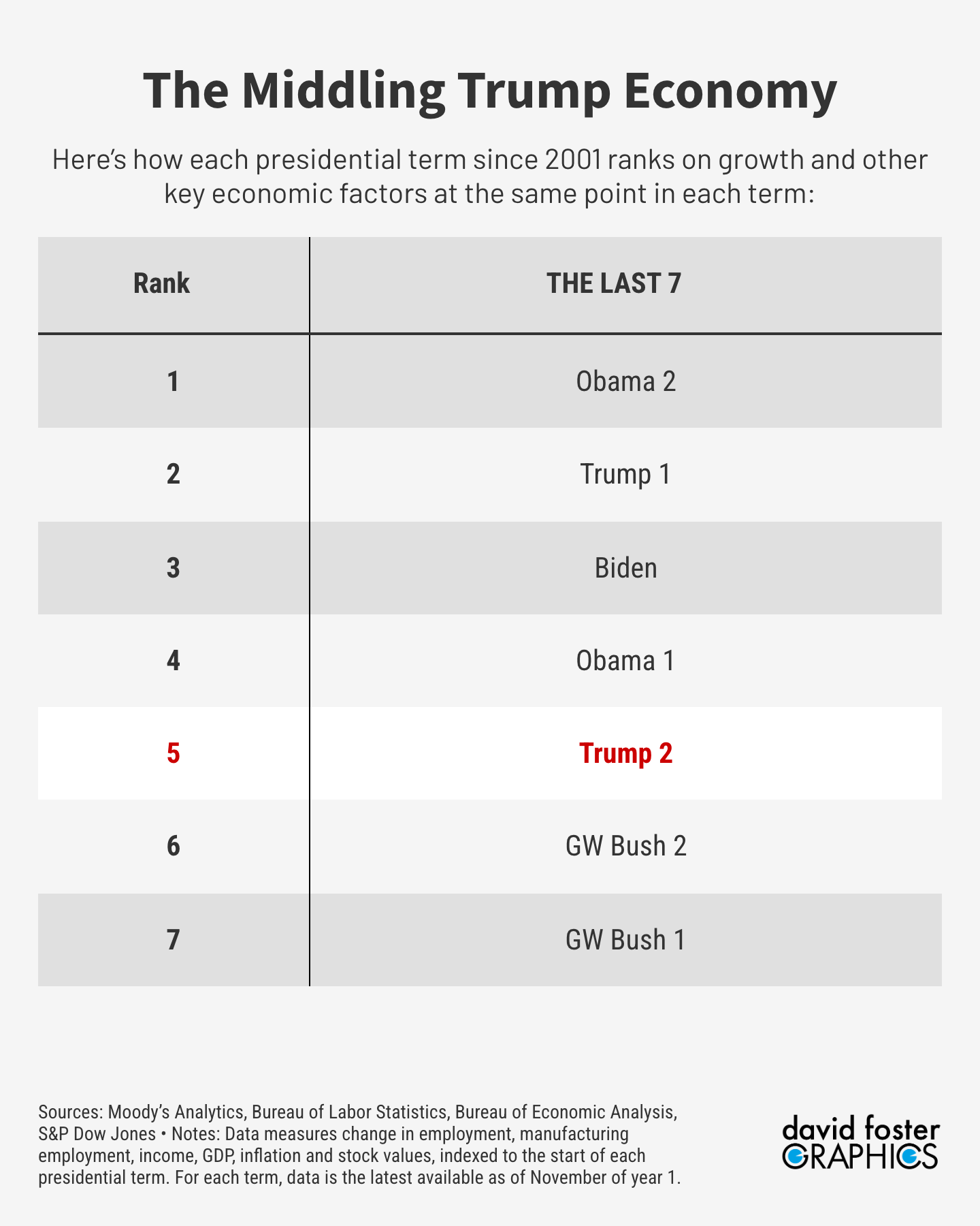
Here’s our overall ranking of the last seven presidential terms. This is not subjective. We tally the index scores and rank them from highest to lowest.
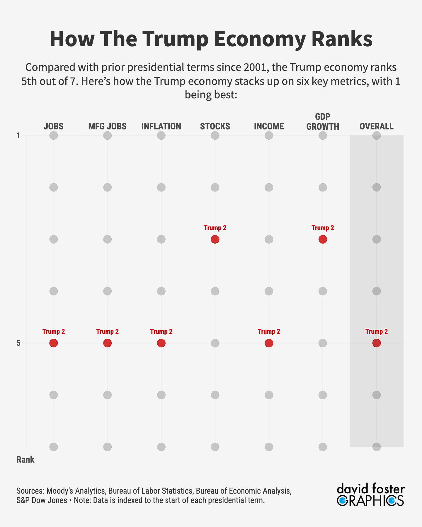
Here’s how Trump ranks overall, and on each of our six metrics:
These charts compare the Trump economy with each of the prior presidents on the metric that’s highlighted. Trump is in red, with the other presidents in gray.